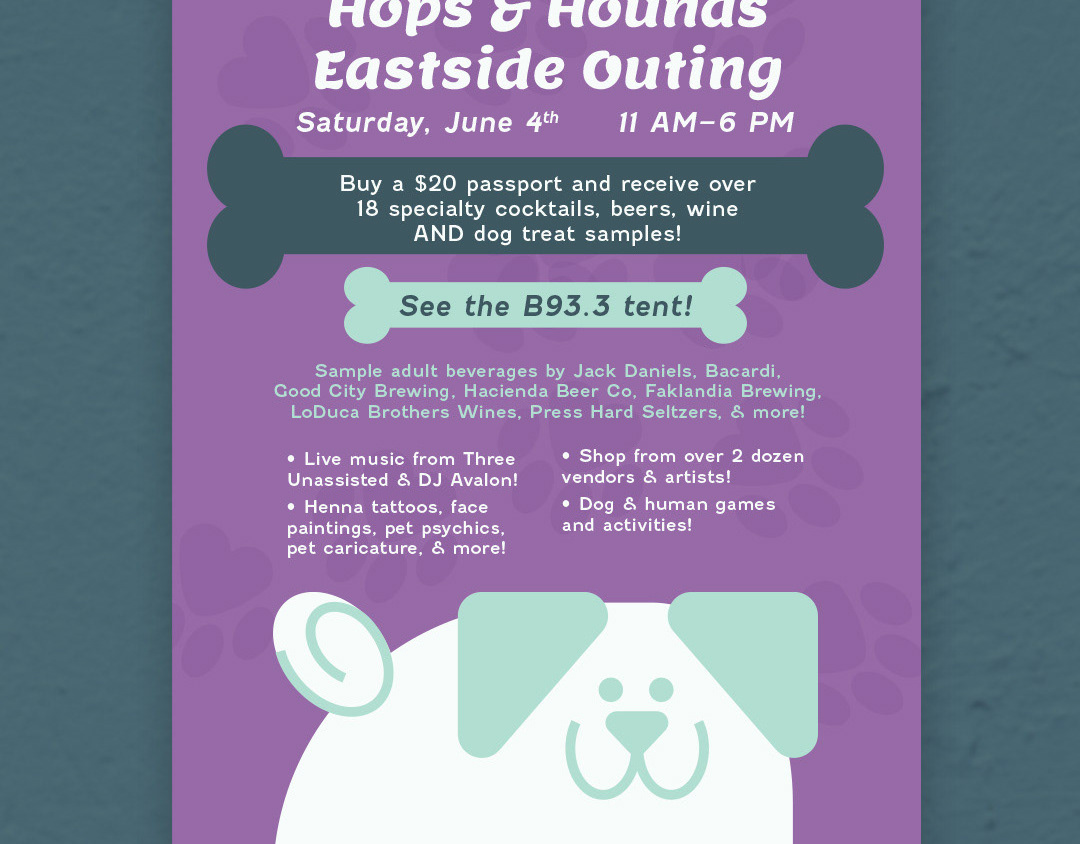
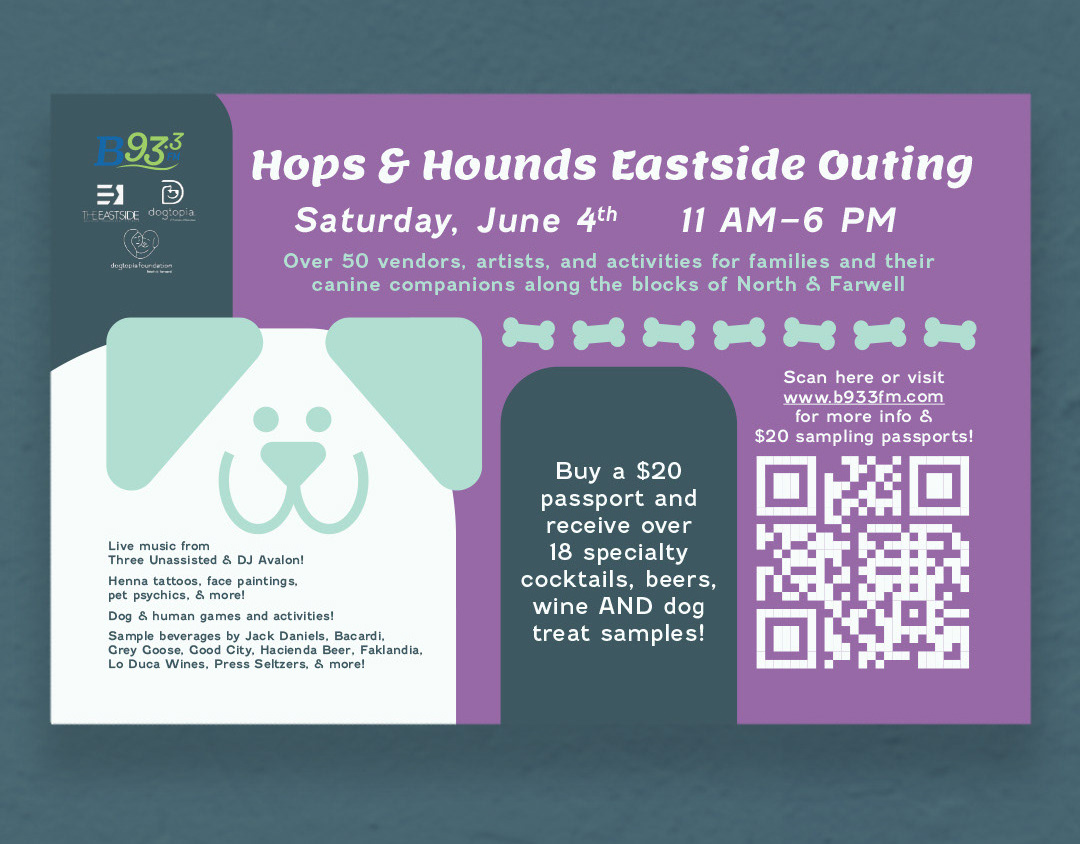
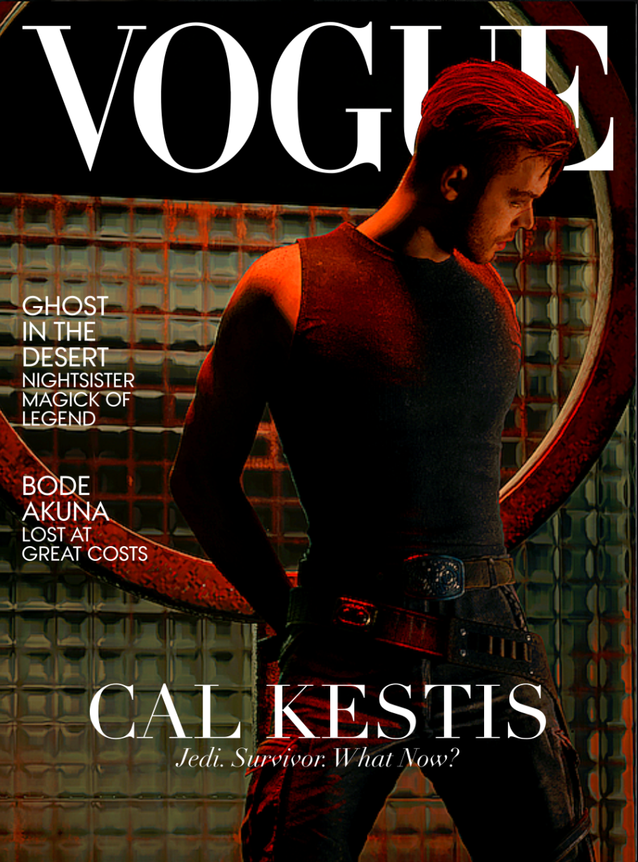
In April 2024, my friend and I made the decision to go to Fanexpo Chicago in August to meet Cameron Monaghan. I became enamored with Monaghan's work in 2021 when I played Jedi: Fallen Order for the first time and experienced his performance as Cal Kestis, and he quickly became my favorite Jedi in the Star Wars franchise. In the months leading up to attending the convention, I struggled with what I would bring to have Monaghan sign. I own just about every piece of Cal Kestis merch, but Monaghan has probably seen all this a thousand times over, I wanted to stand out (just a little bit). Around this time, I'd also joined a Discord server with other Cal Kestis fans and one friend was expressing an interest in designing a Vogue-style cover with the Jedi. I thought this sounded fun! I wanted to join! This is where the first variations of English and Aurebesh covers were designed. Very different from the end product!
Lots of things changed here. Alignments, the Aurebesh treatment of "Vogue", feature titles, among other little adjustments. Here's the kicker—I had so much fun focusing on the covers, I figured "yeah, I could design some interior spreads" much like the TRVLR magazine designed for a publication design class in college.
At this time, I was using Inkscape to design. Why not Adobe? Because I was graduating college and anticipating losing my Adobe license. I wasn't too keen on subscribing, especially when open-source software exists and can perform similarly towards the desired outcome.
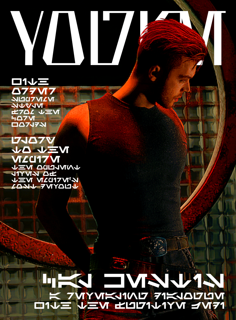
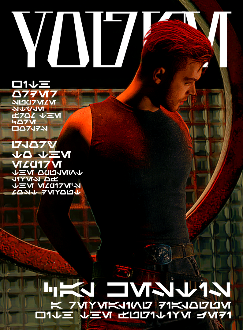
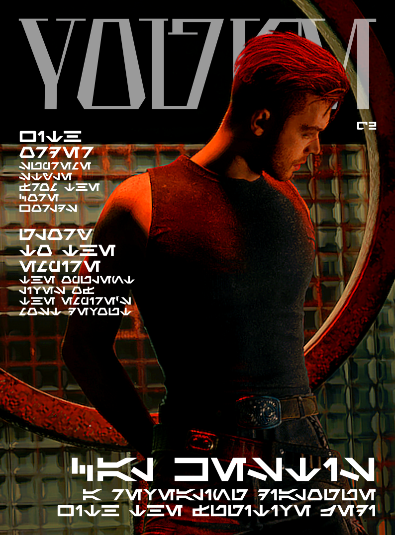

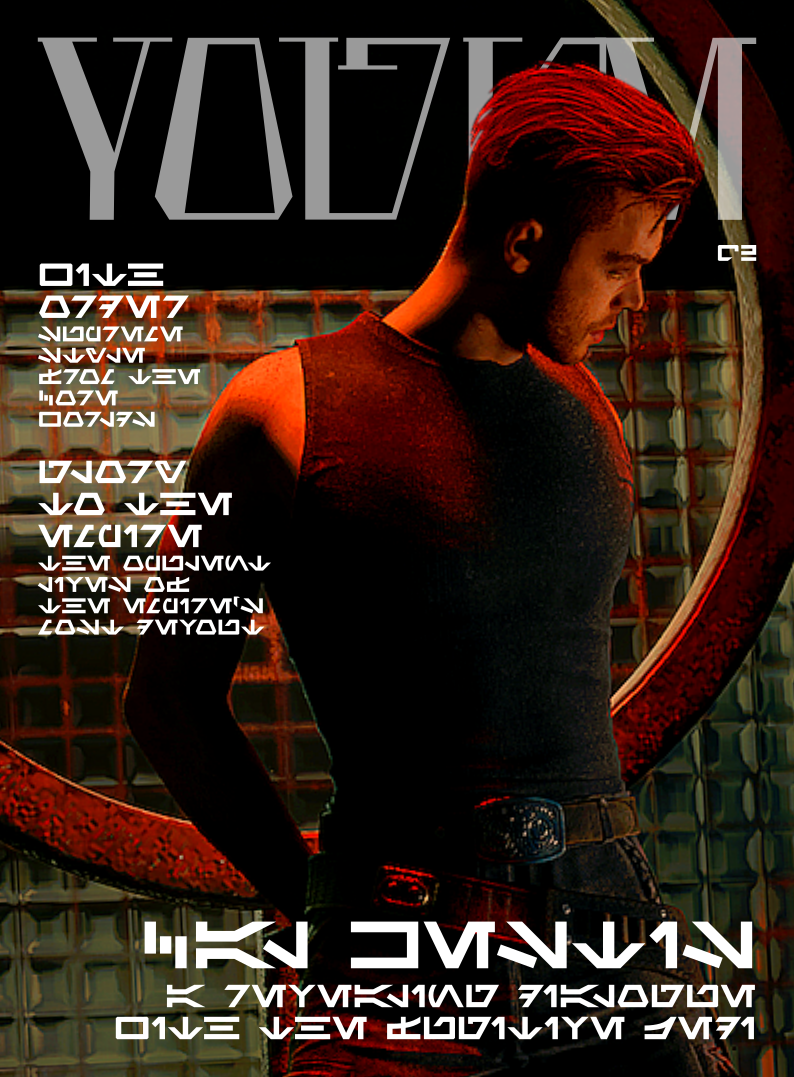
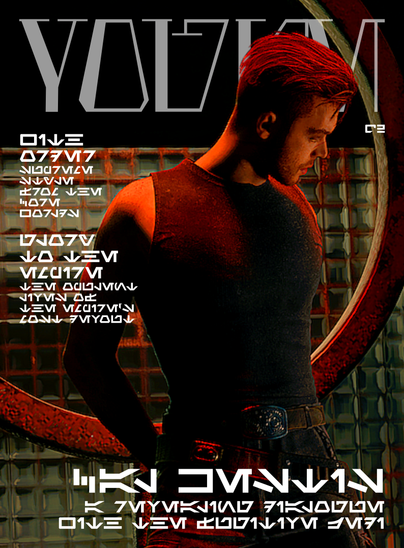
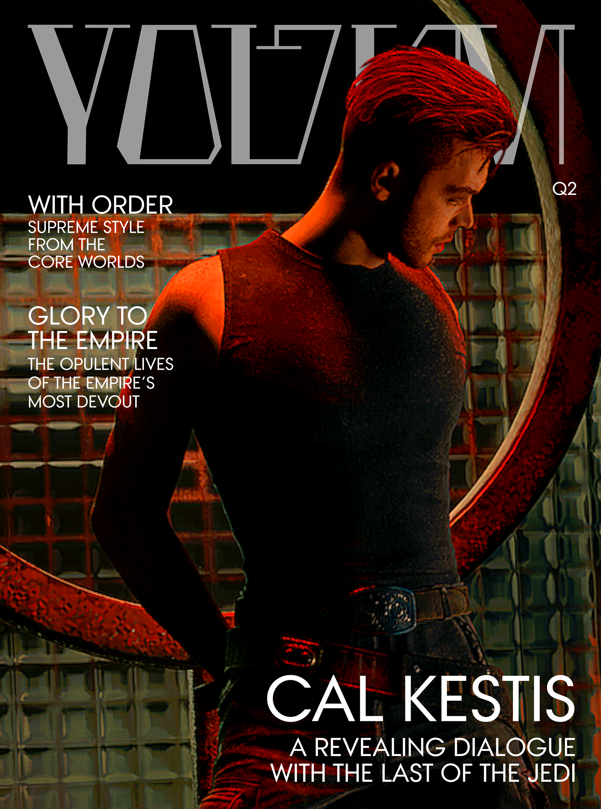
Plenty of variations were created. Experimenting with sizing, layout, opacity, line lengths, and type. It was sure a challenge to both match and balance the English and Aurebesh versions.
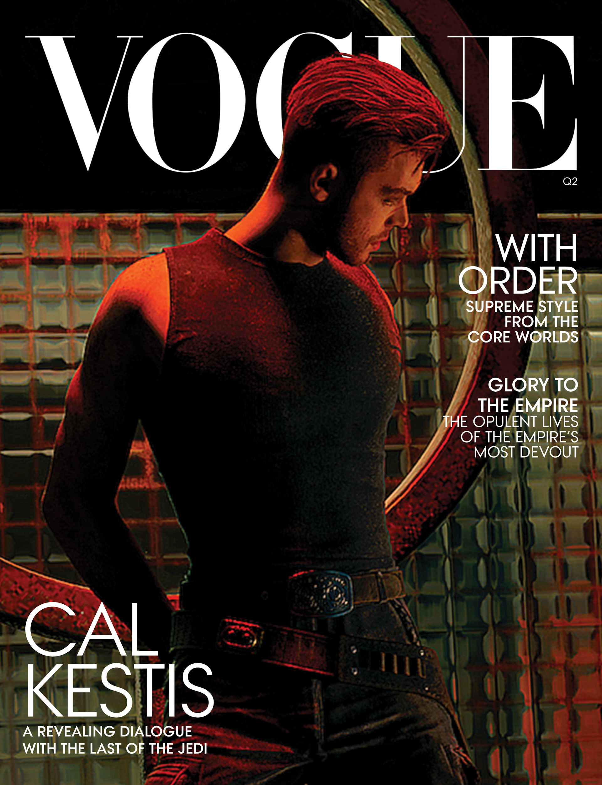
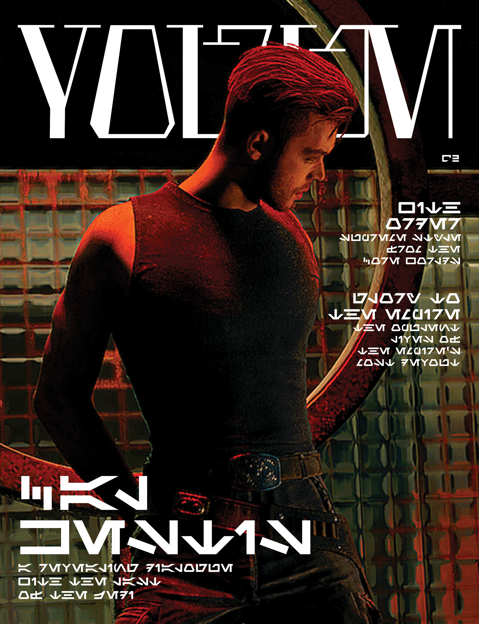
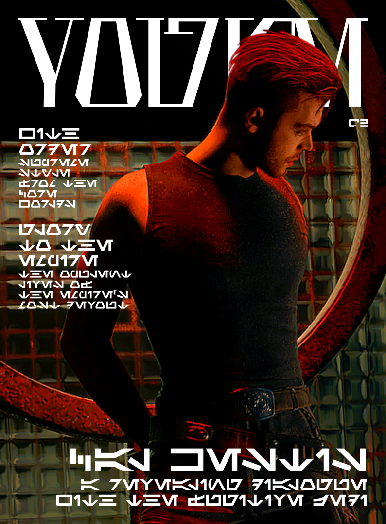
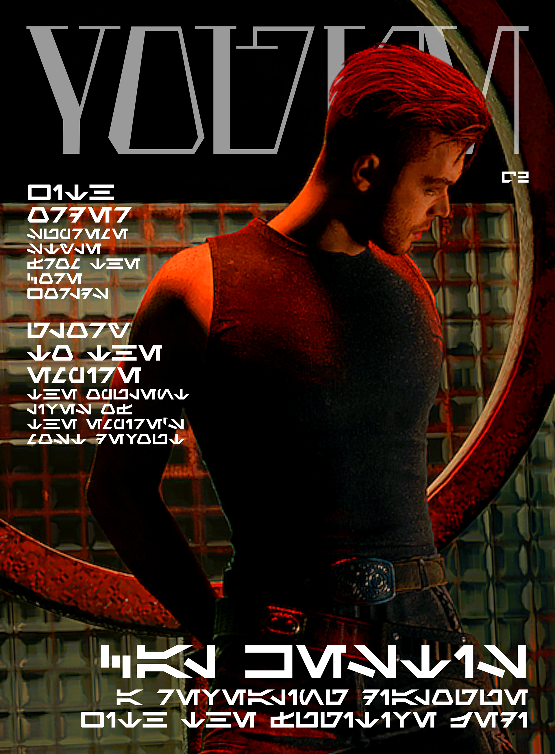
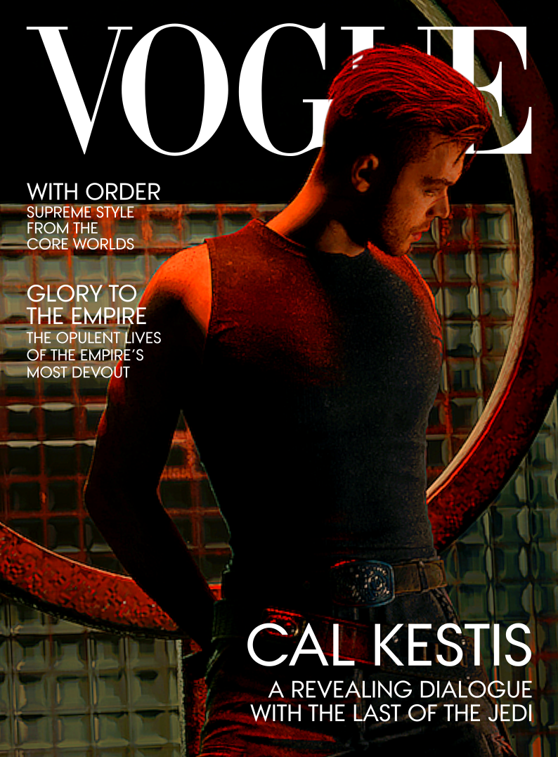
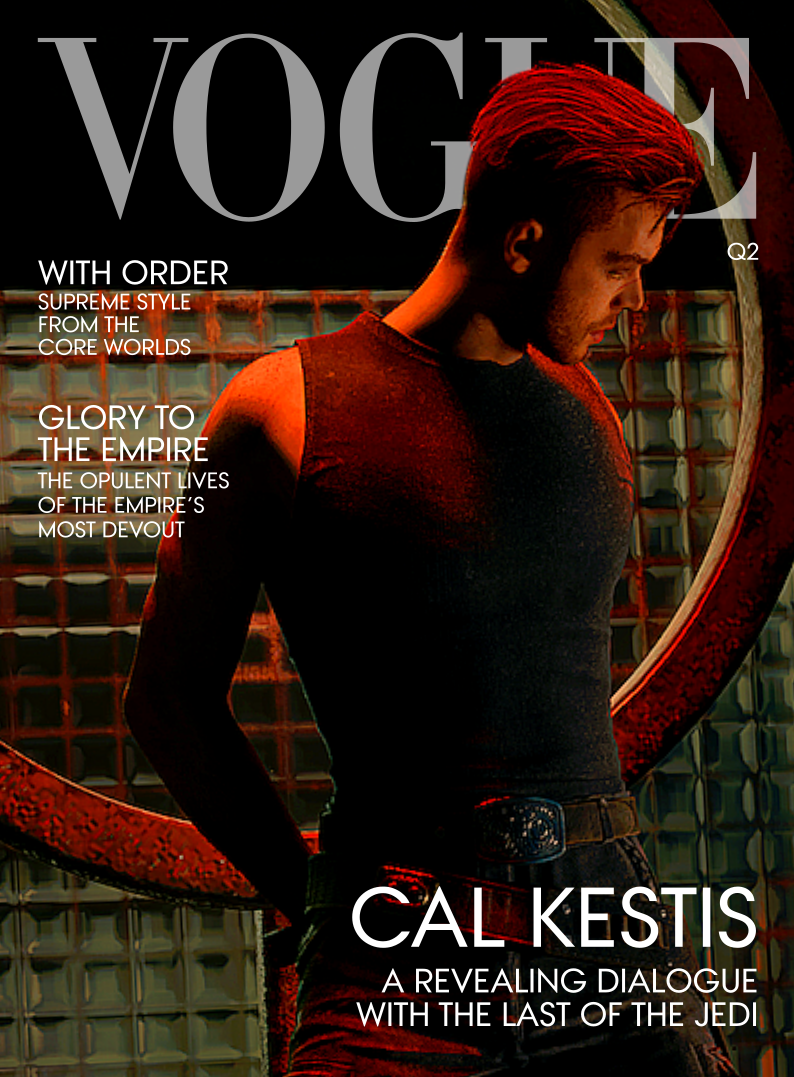
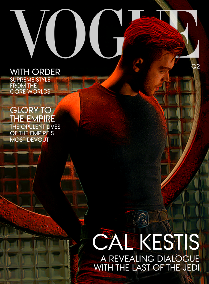
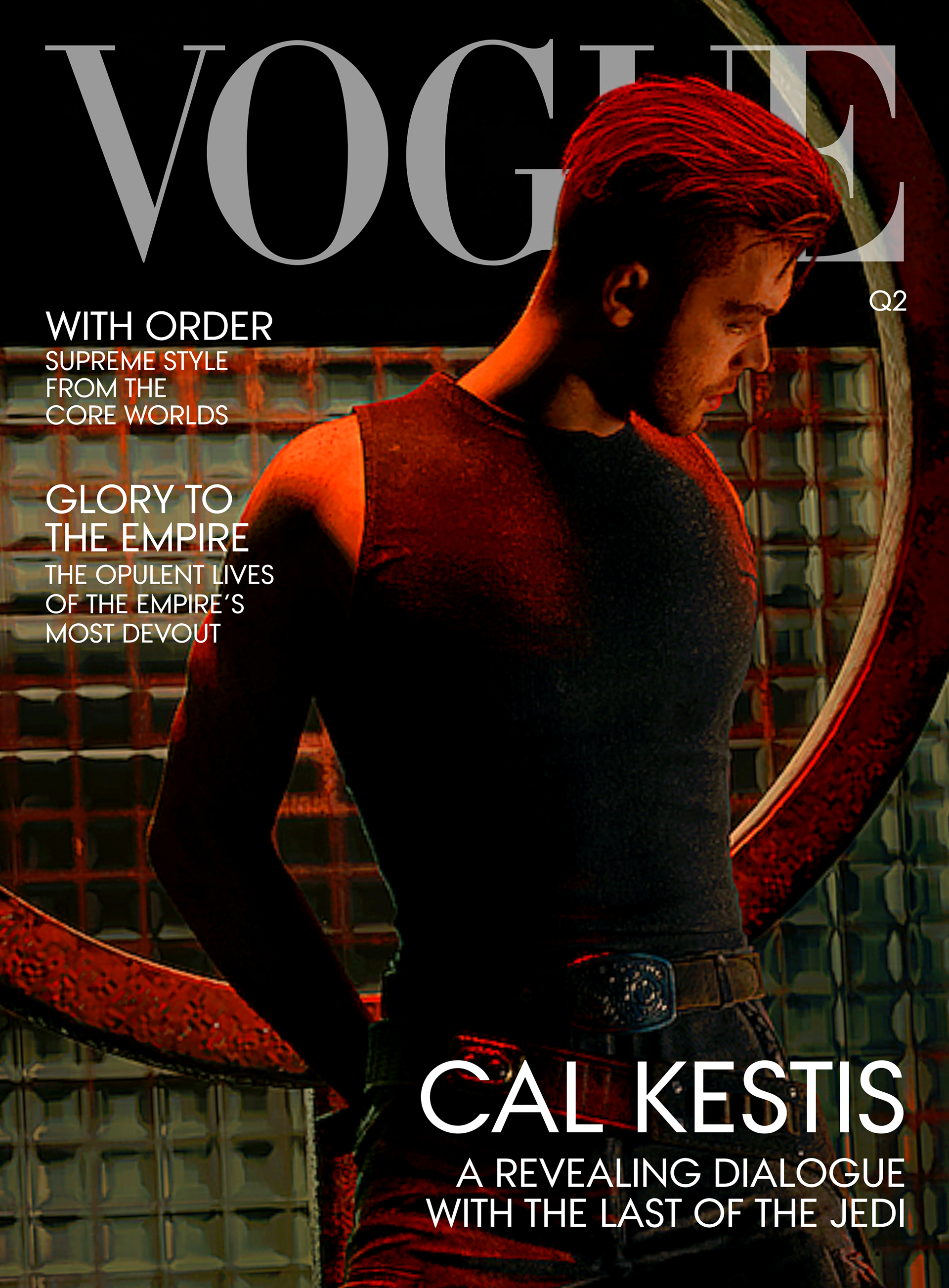
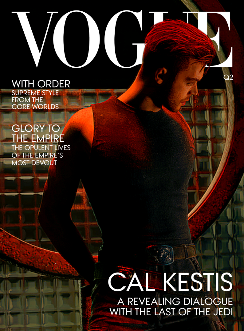
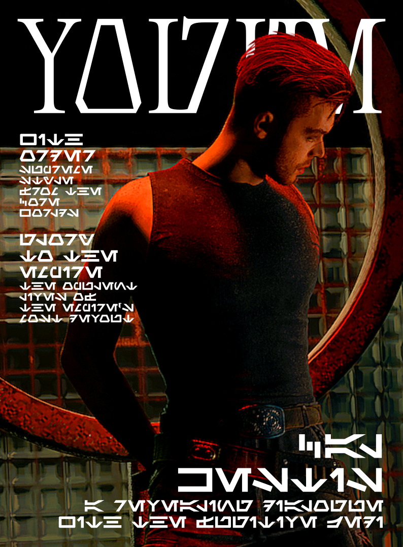
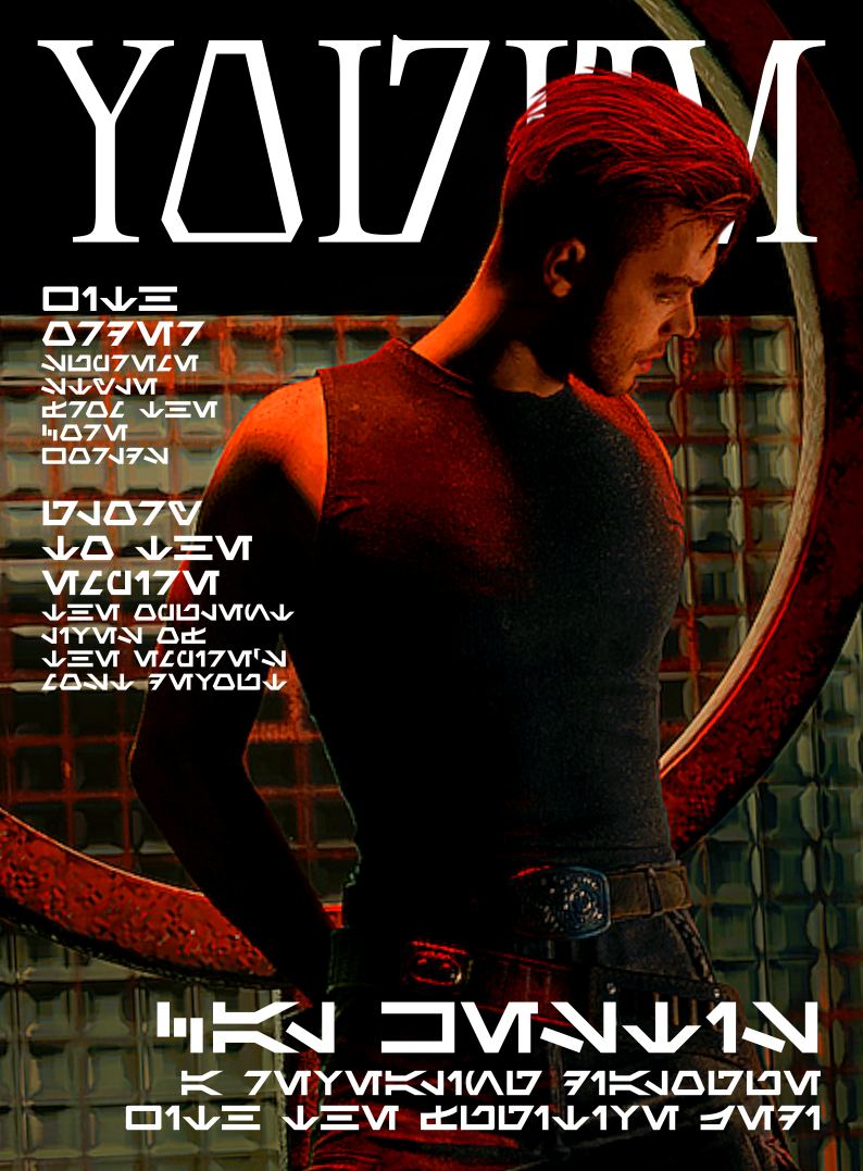
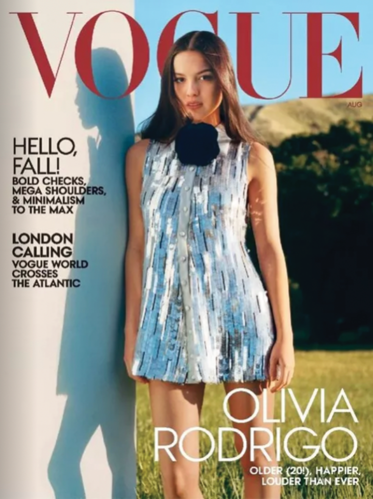
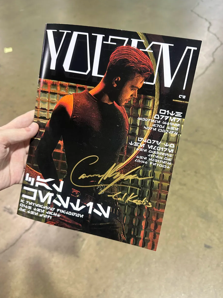
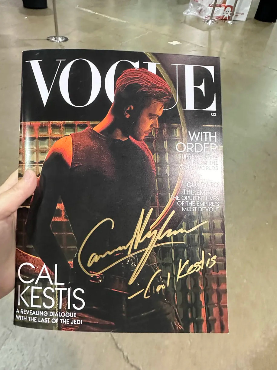
Final covers for English & Aurebesh versions, respectively.
Of course, to mimic the Vogue structure and feel, I needed to look at Vogue material. For the Aurebesh version, I surrounded myself as much in-universe graphics that I could. The bulk of the graphics came directly from Jedi: Survivor, which aligned with the narrative I wrote.
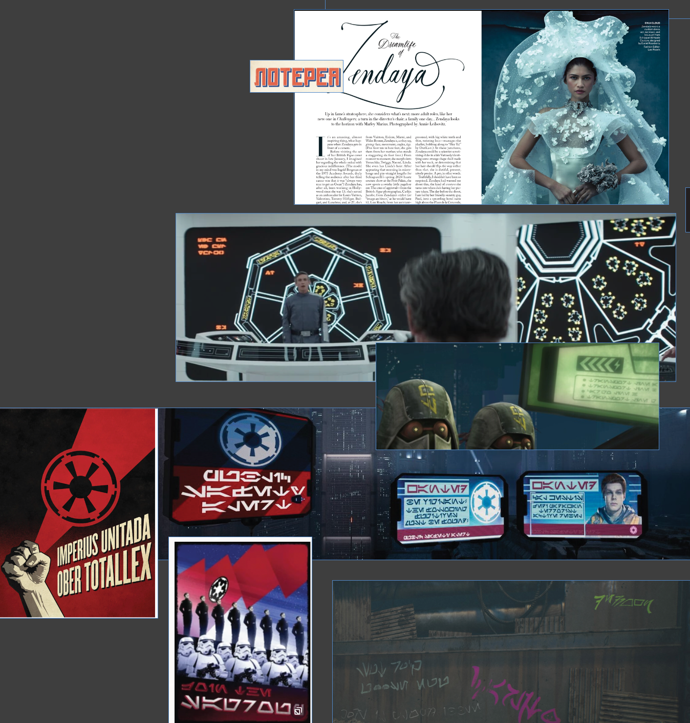
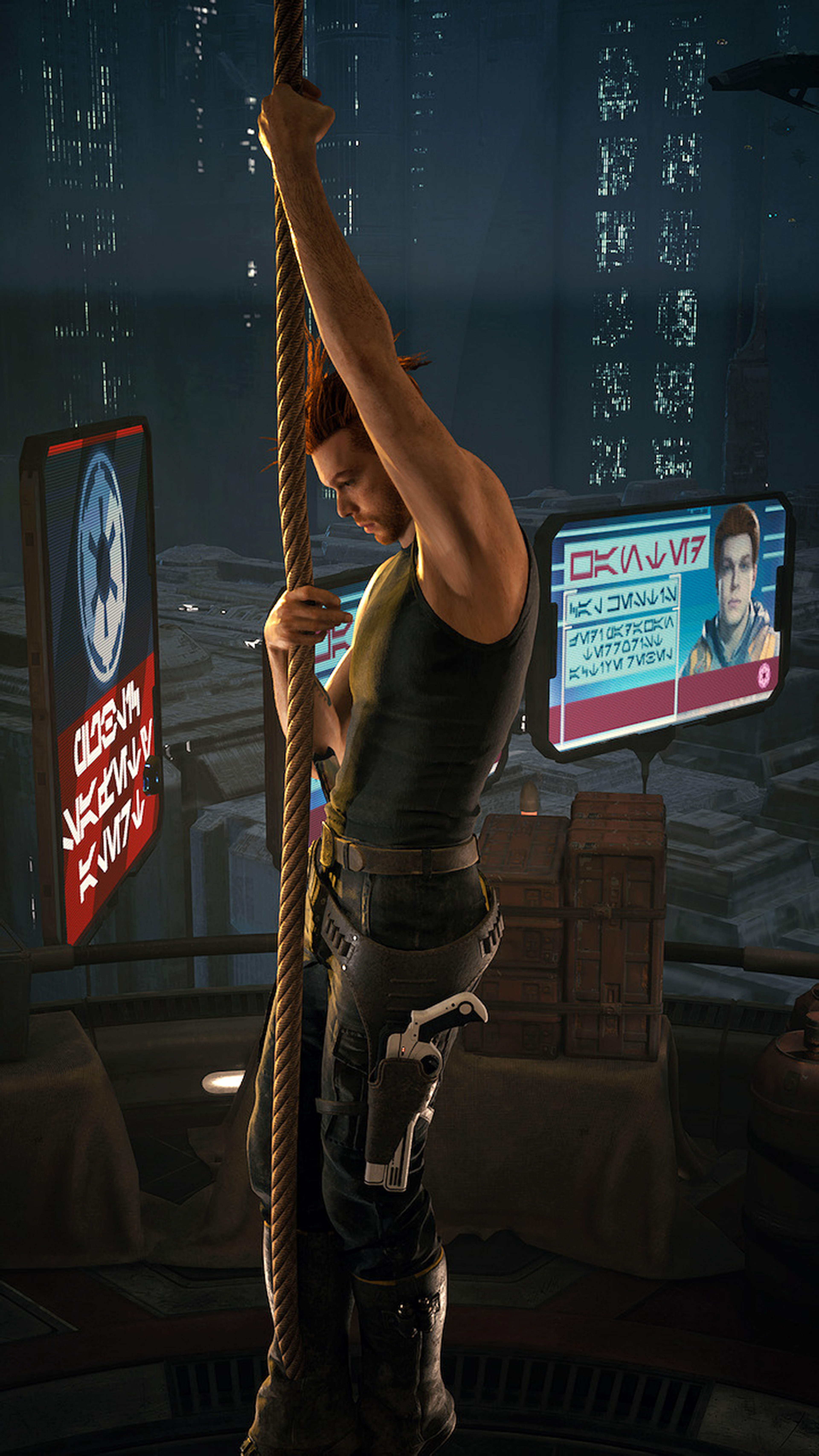
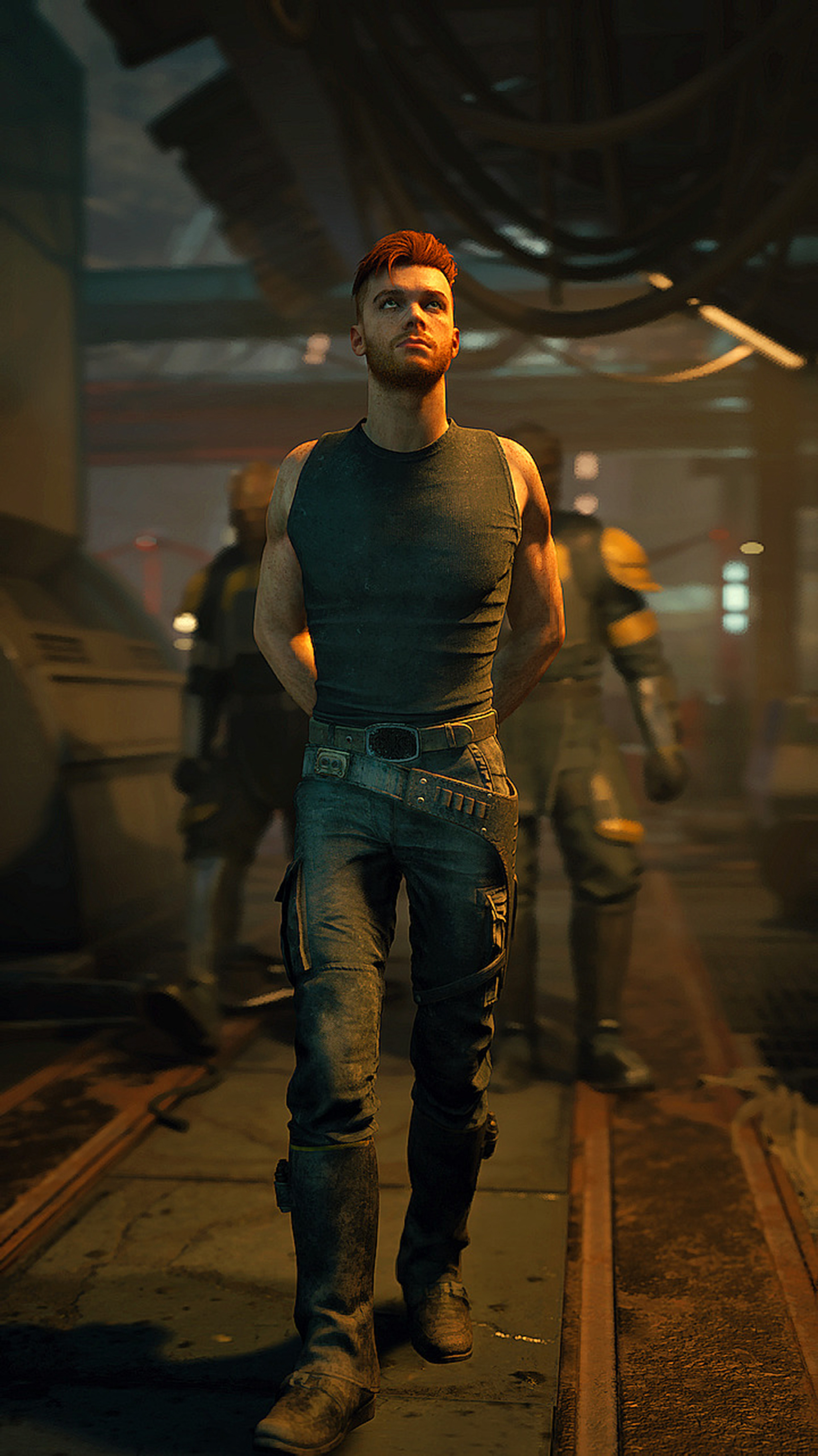
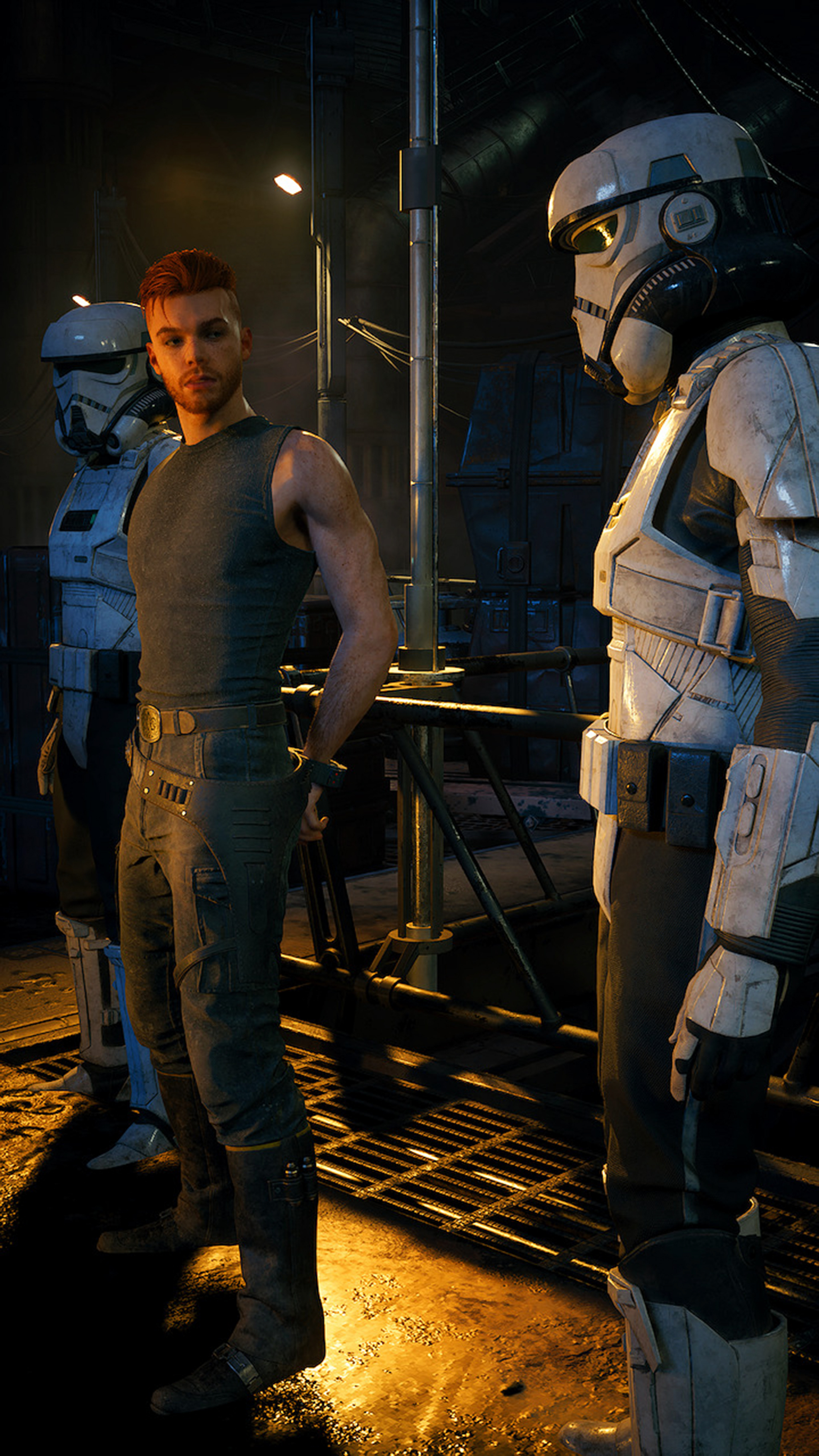
Before I proceed further, I need to express my admiration and give so much credit to FlamMabel. This magazine truly wouldn't have been the same without her photography and I'm honored that I was given permission to design with her in-game captures.
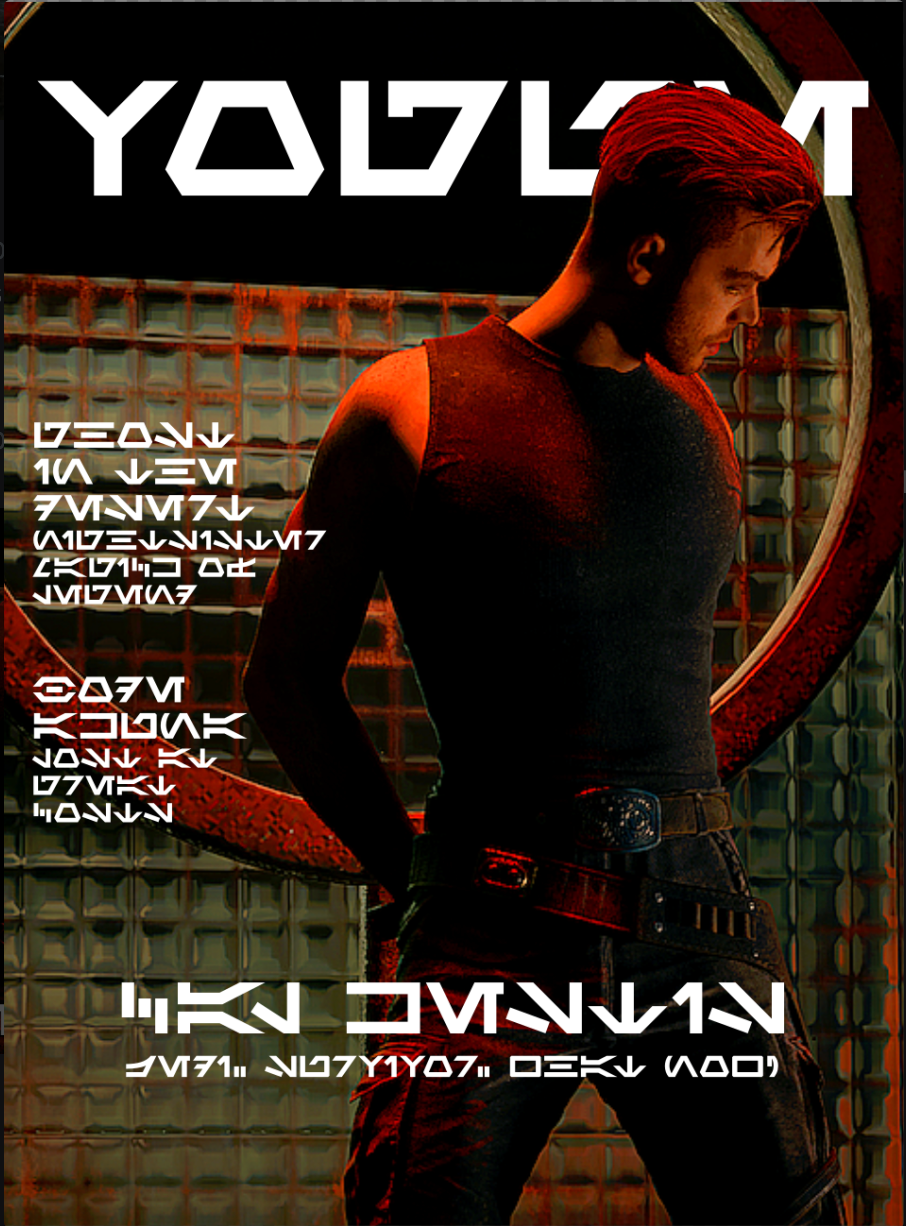
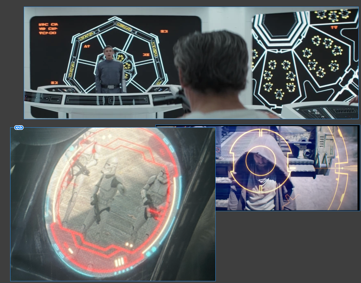
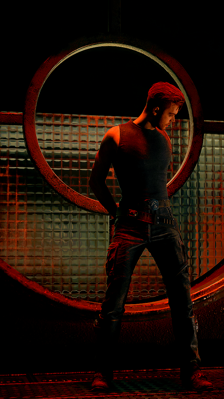
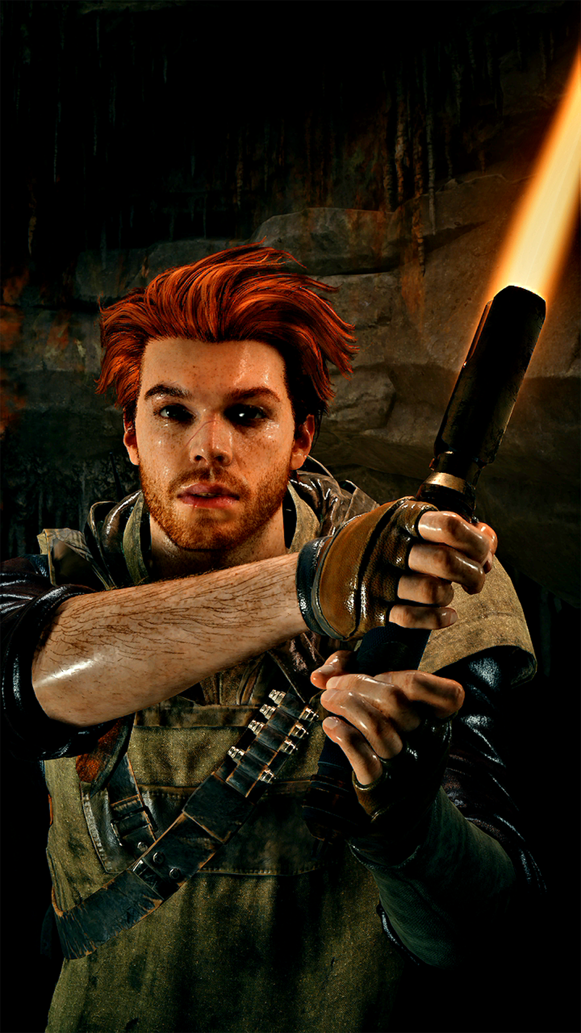
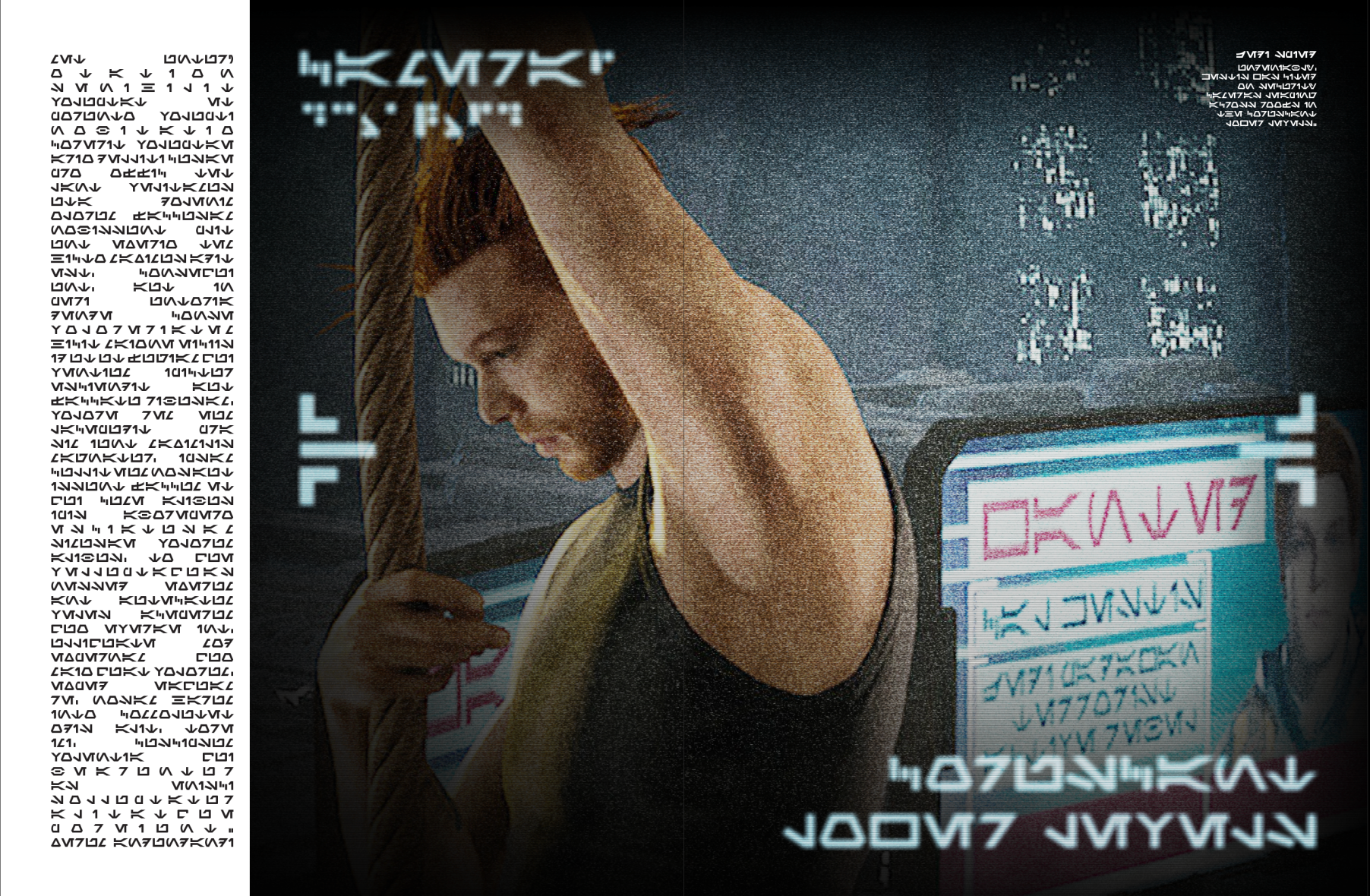
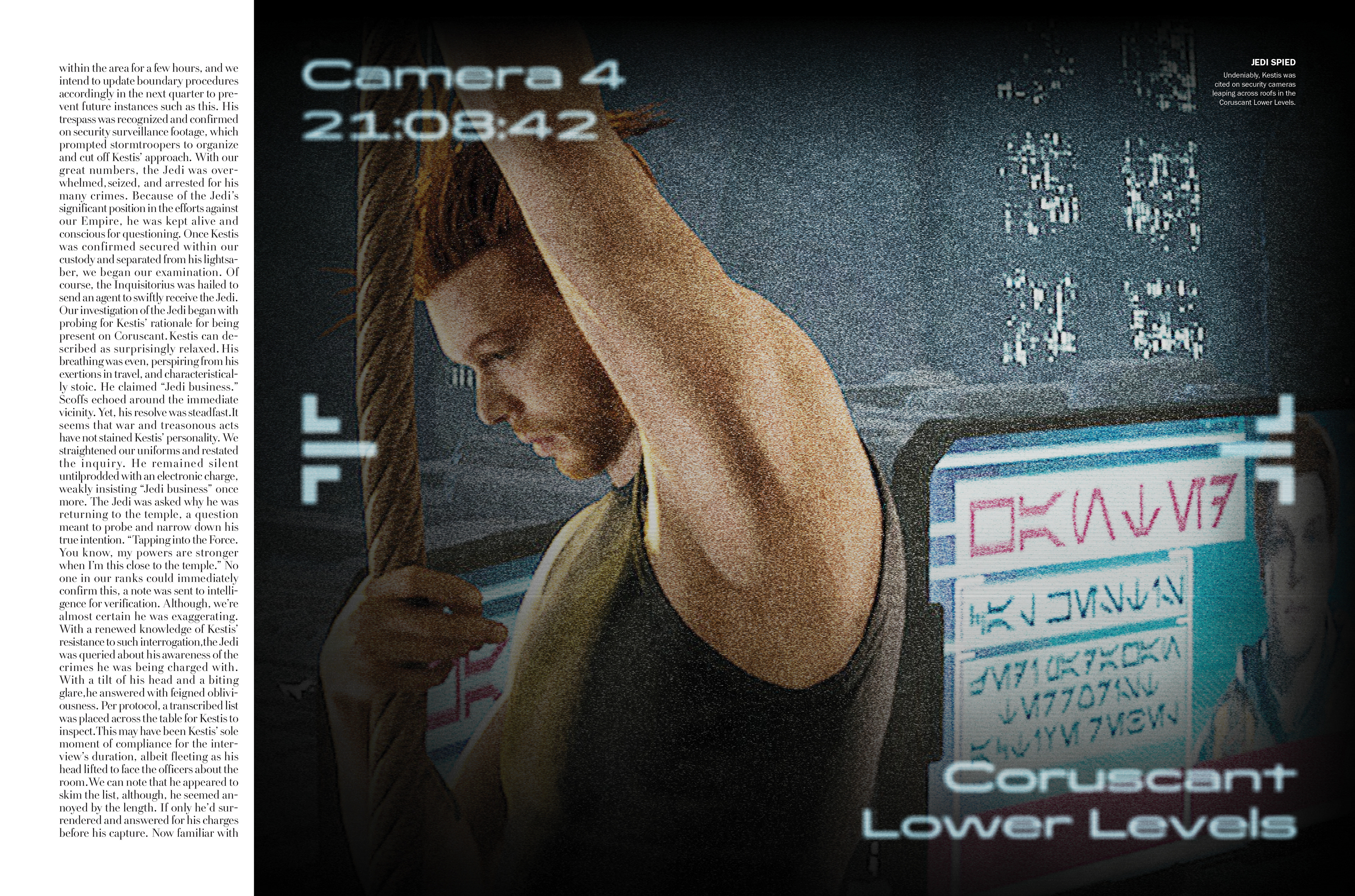
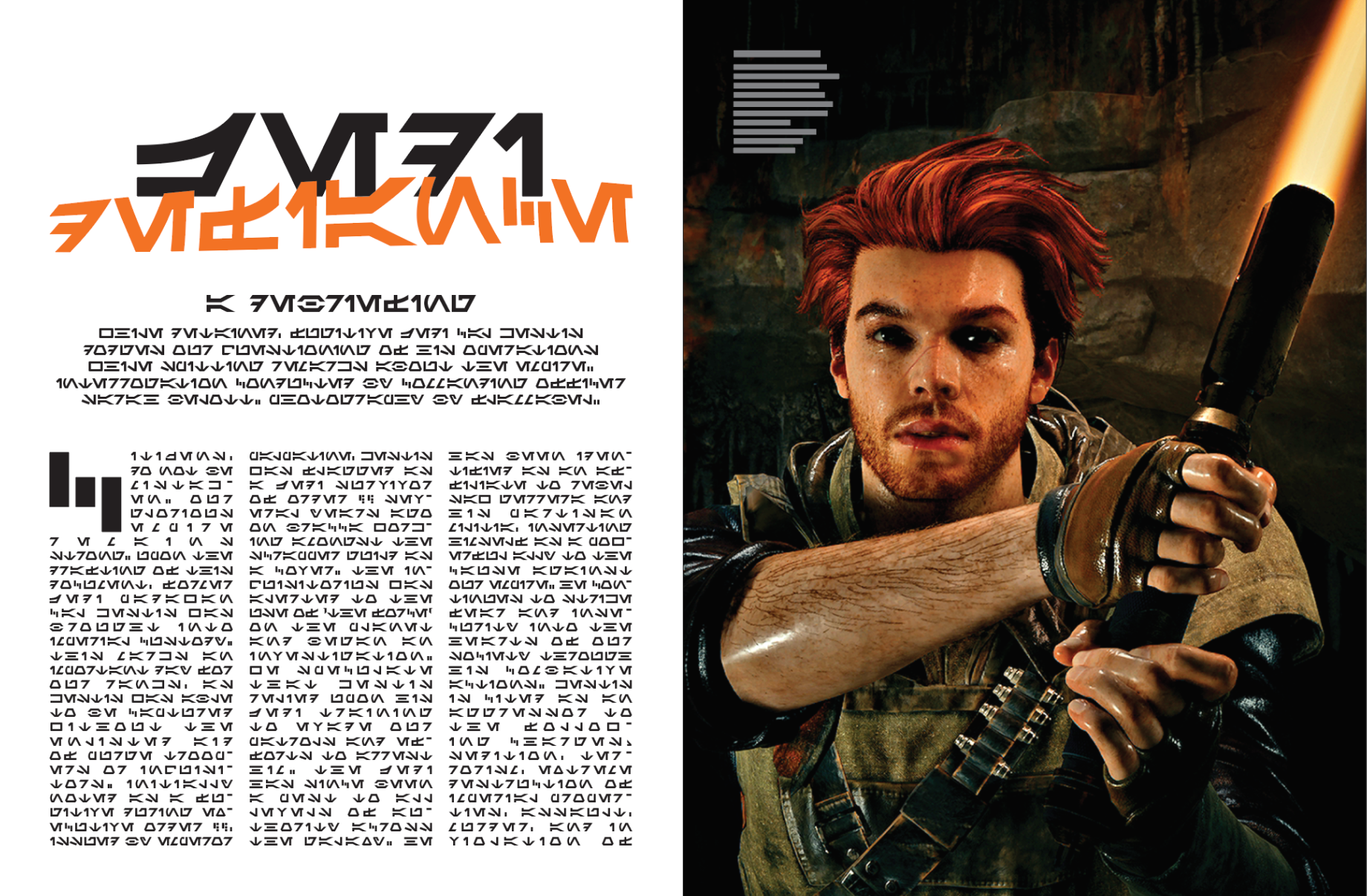
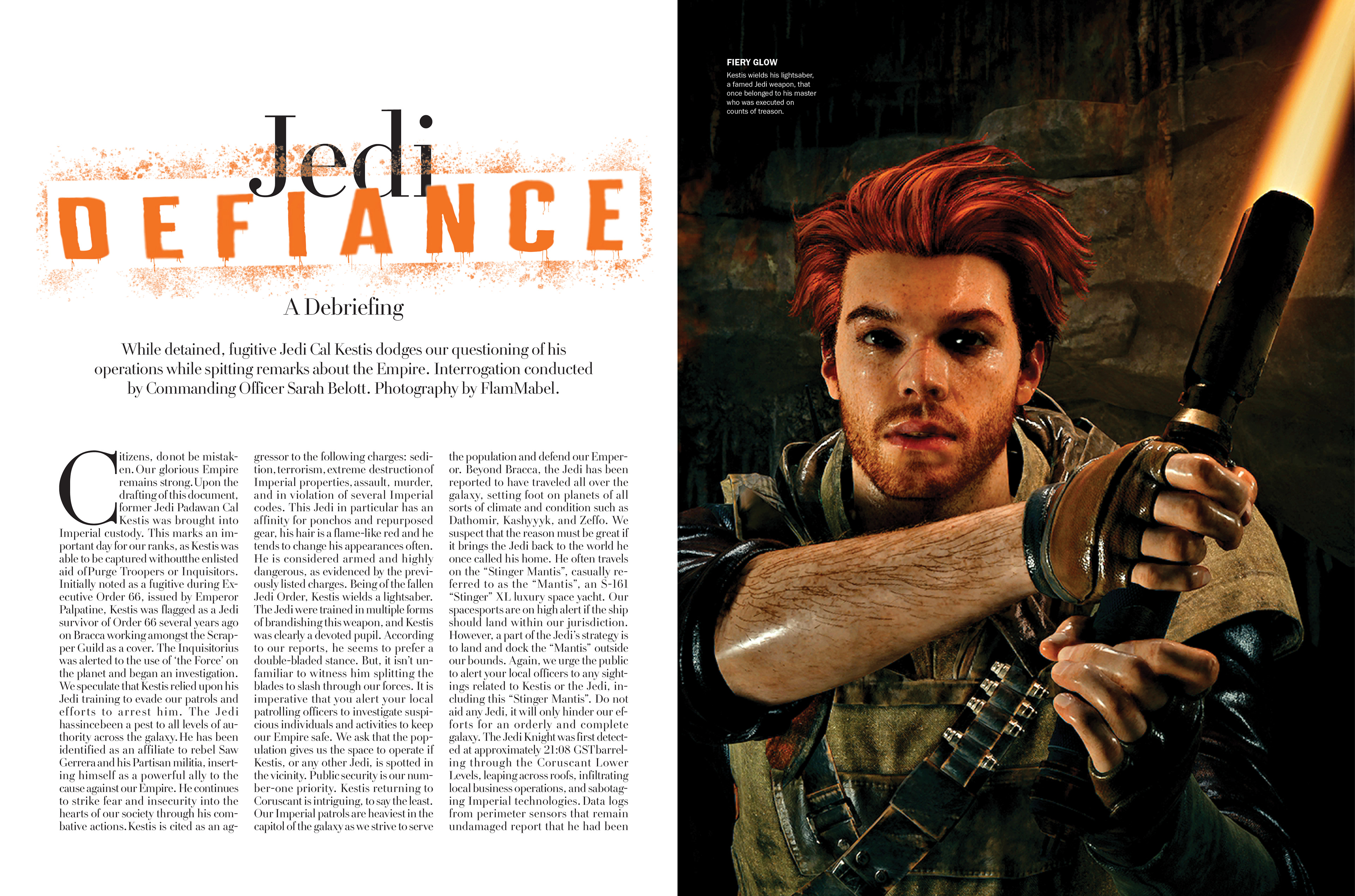
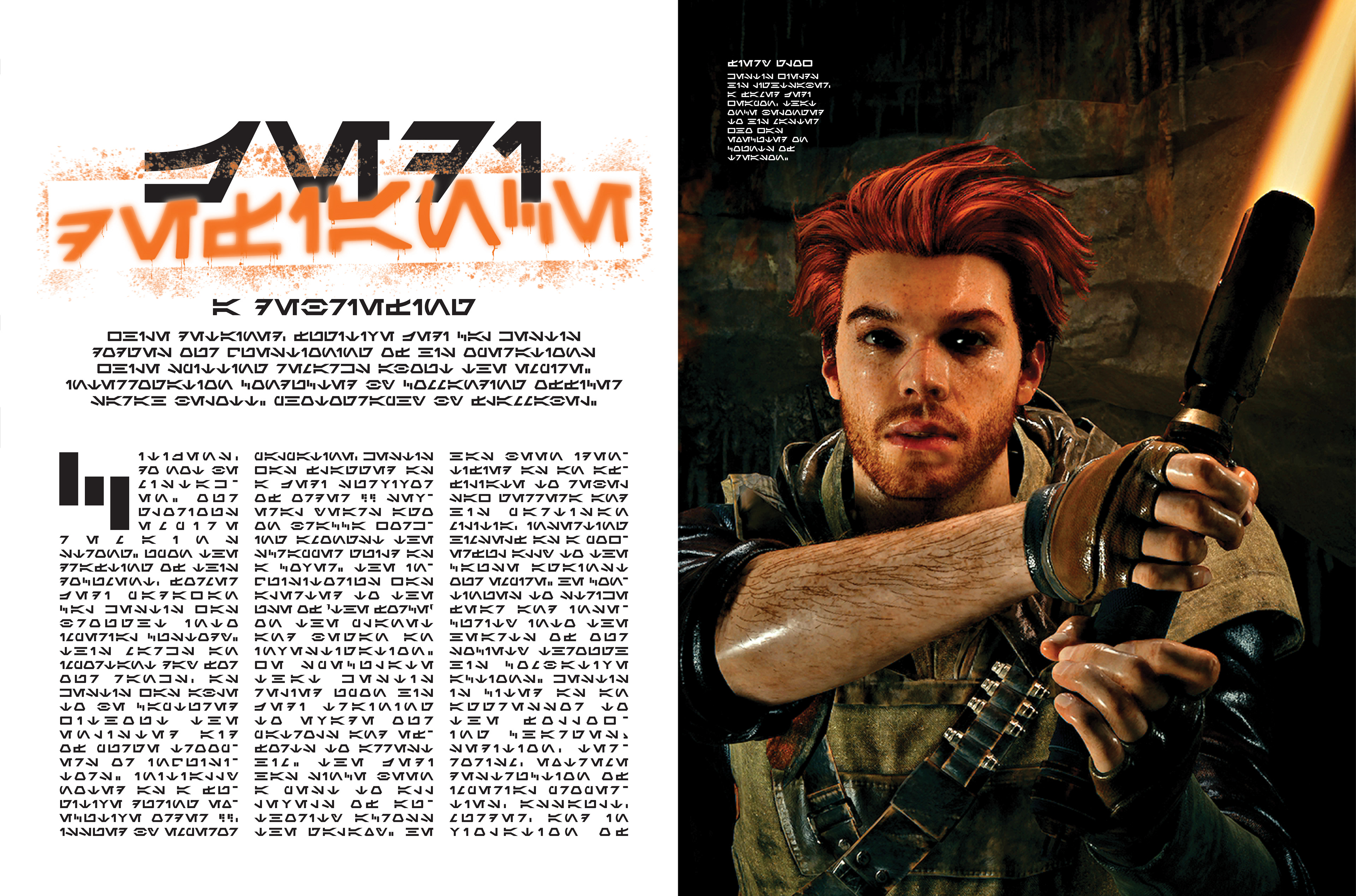
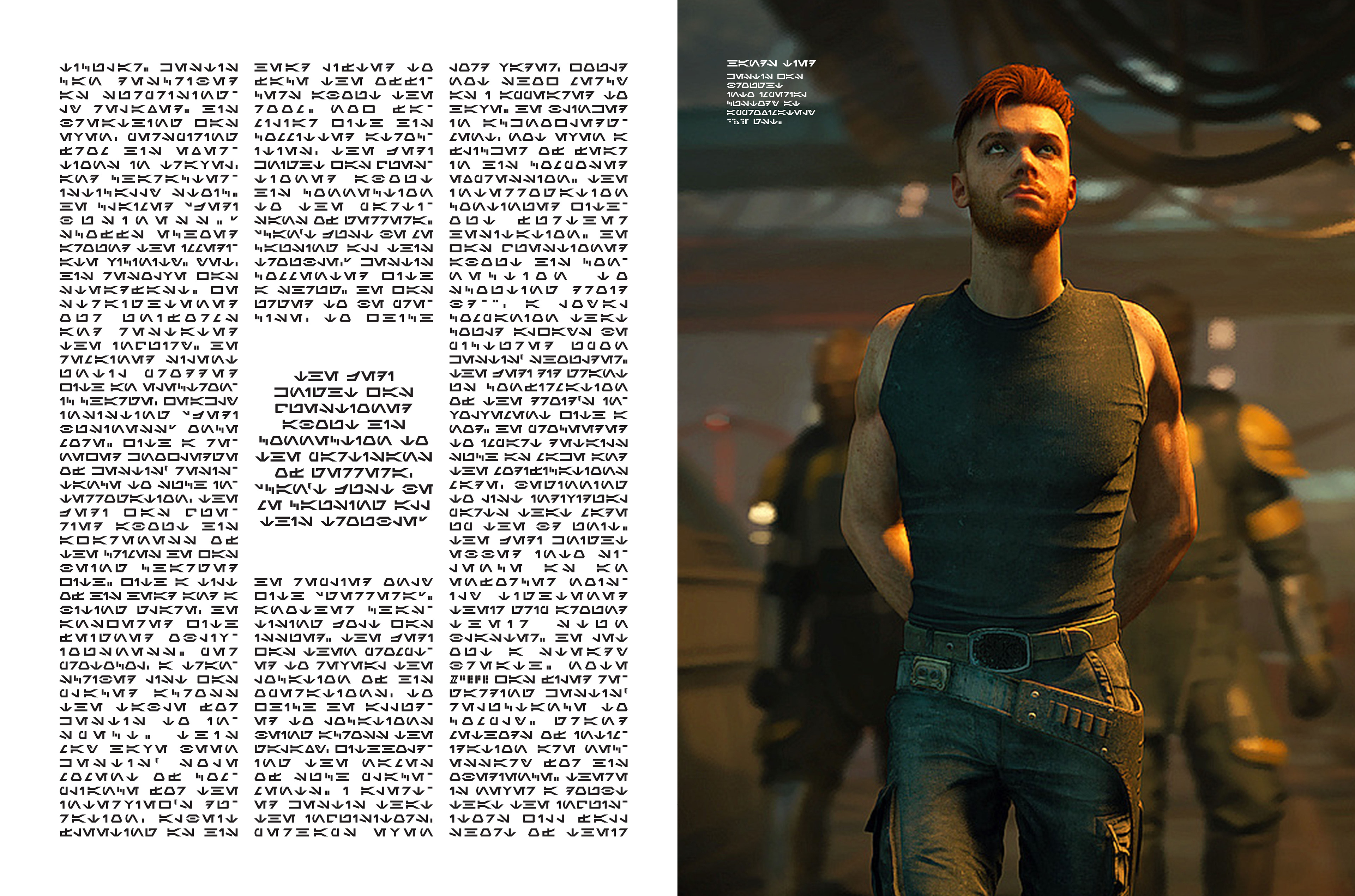
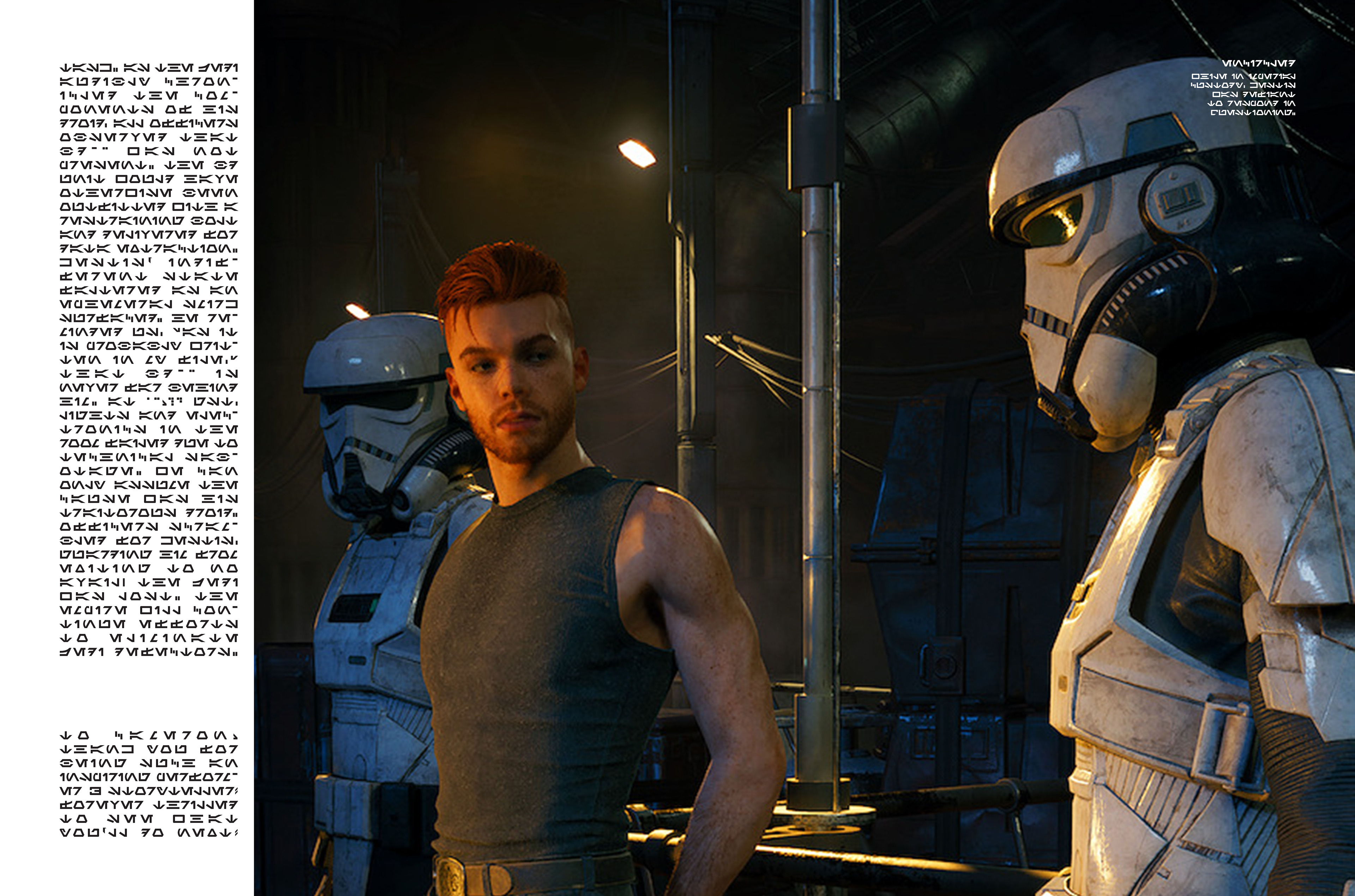
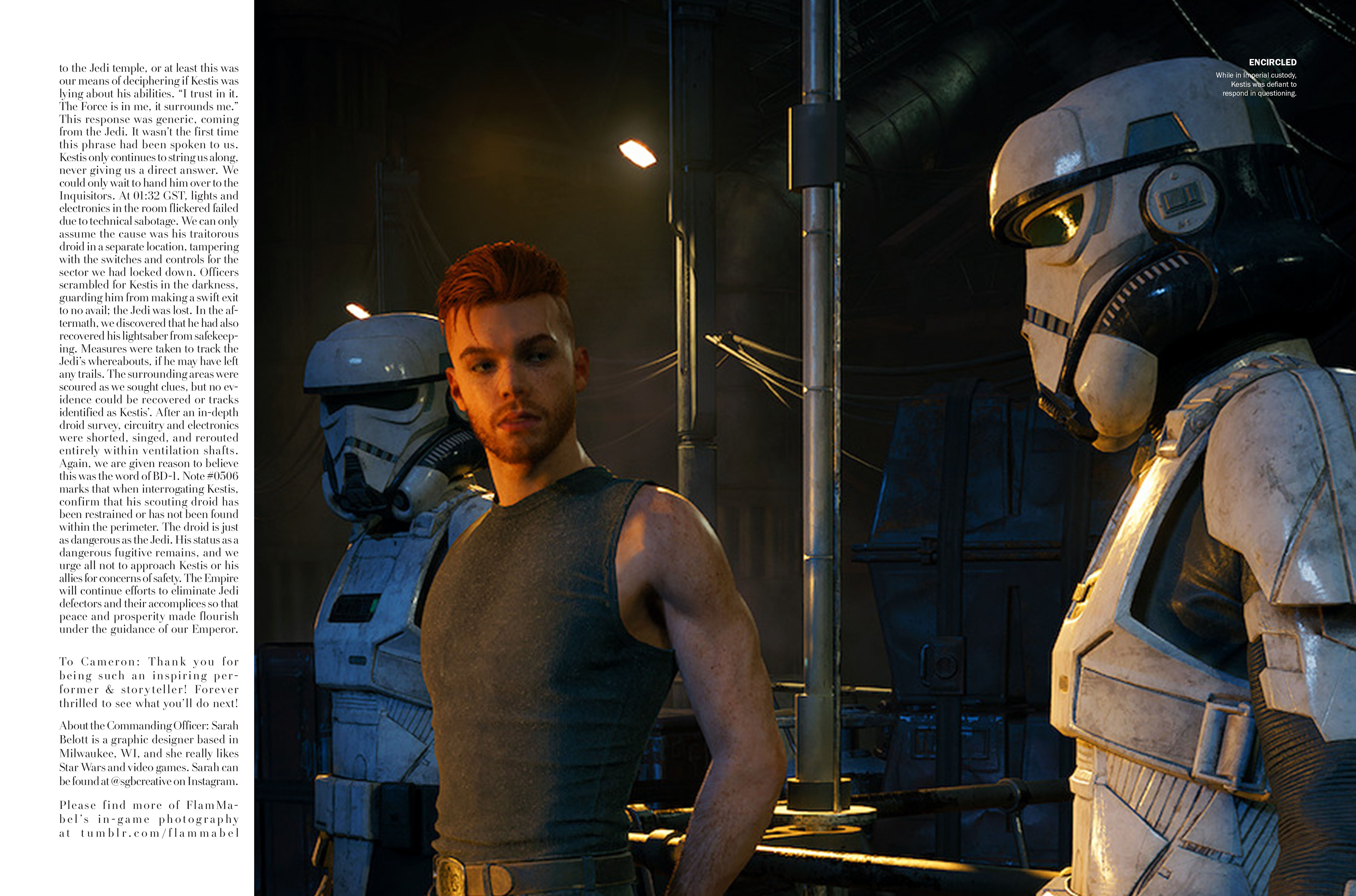
Below are the images I selected for the magazine, in that exact order. Yes, the order is relevant! The first in the line-up is the cover, a stylistic shot that presents the situation that Cal is currently in at the time of the in-magazine narrative. The second image, of Cal with an orange lightsaber, breaks up this narrative. Why? I used it as a mugshot-type of picture, think of how Wall-E and Eve were caught on camera by Axiom security in Wall-E. From then on, the pictures are meant to reflect the narrative. The Empire have captured Cal during his excursion on Coruscant, he is escorted, and interrogated (before he escapes).
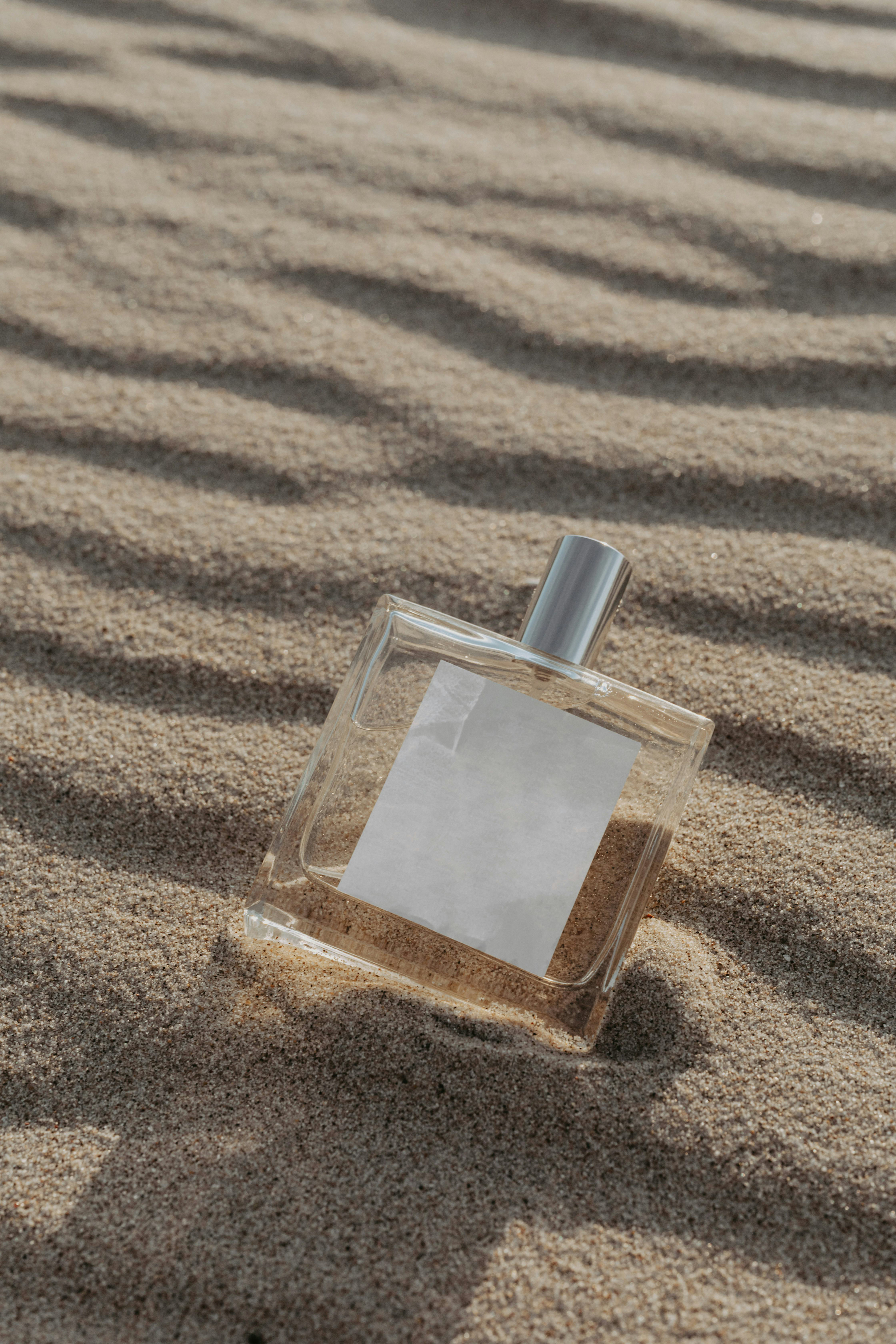
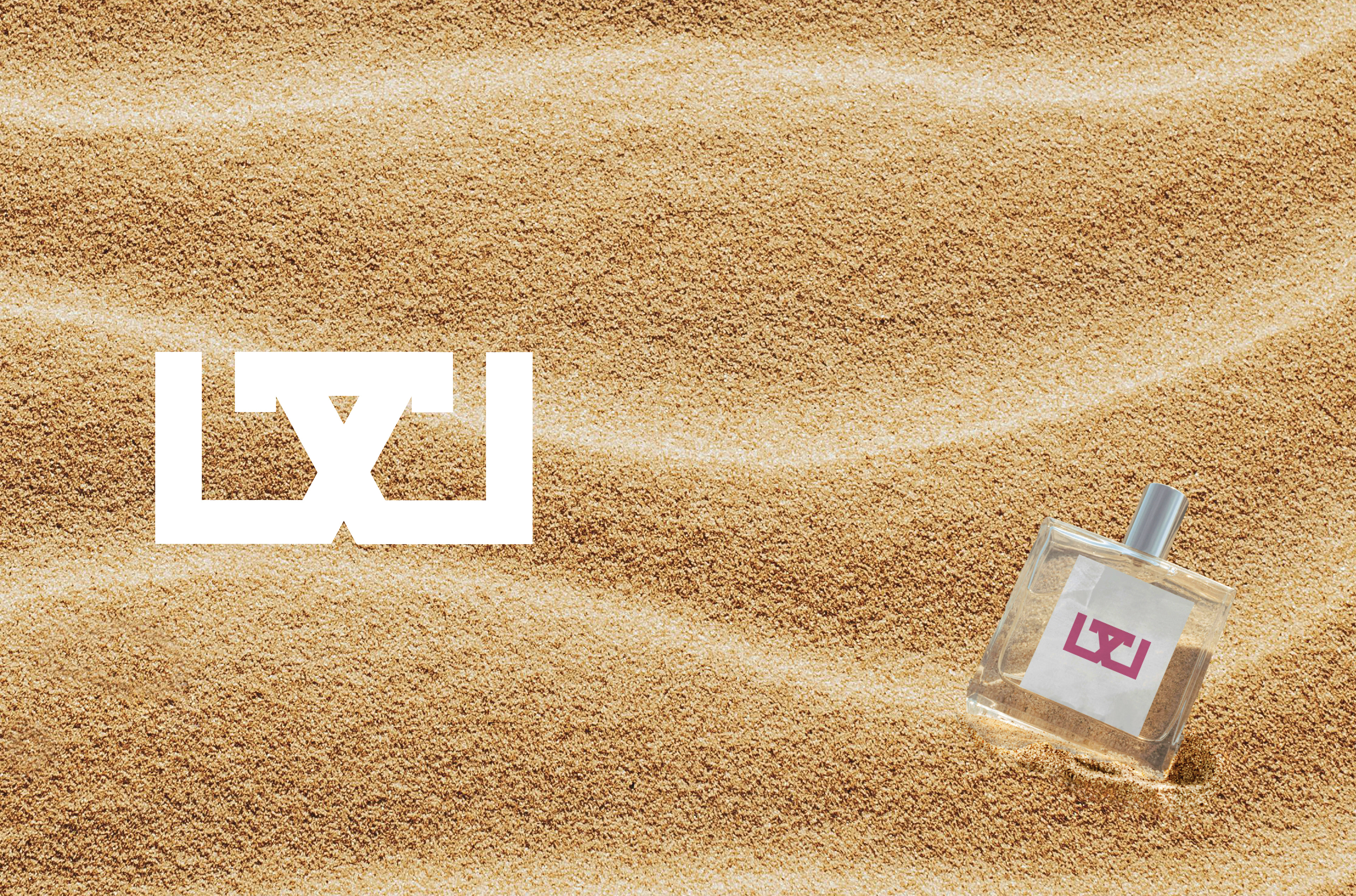
Between working on the written narrative, composing photo captions, creating title treatment for the interior feature spread, I needed to remember that I had to design a back cover! The Vogue magazine I referenced had a Rolex ad, I figured a personal luxury ad would be fitting. I took to Wookieepedia to find an in-universe product. Makeup or perfume seemed like an easy fit, except no brands/makeup types are apparently few and far in-between in Star Wars canon! I settled on Glower, which exists within legends. I'd make it work. It sounded like a type of highlighter.
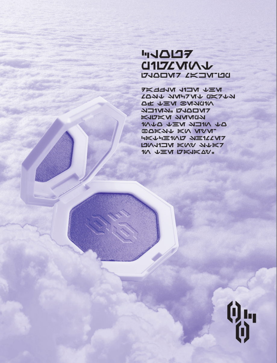
An early concept of the Glower back cover ad in Aurebesh, alongside the final versions in Aurebesh and English.
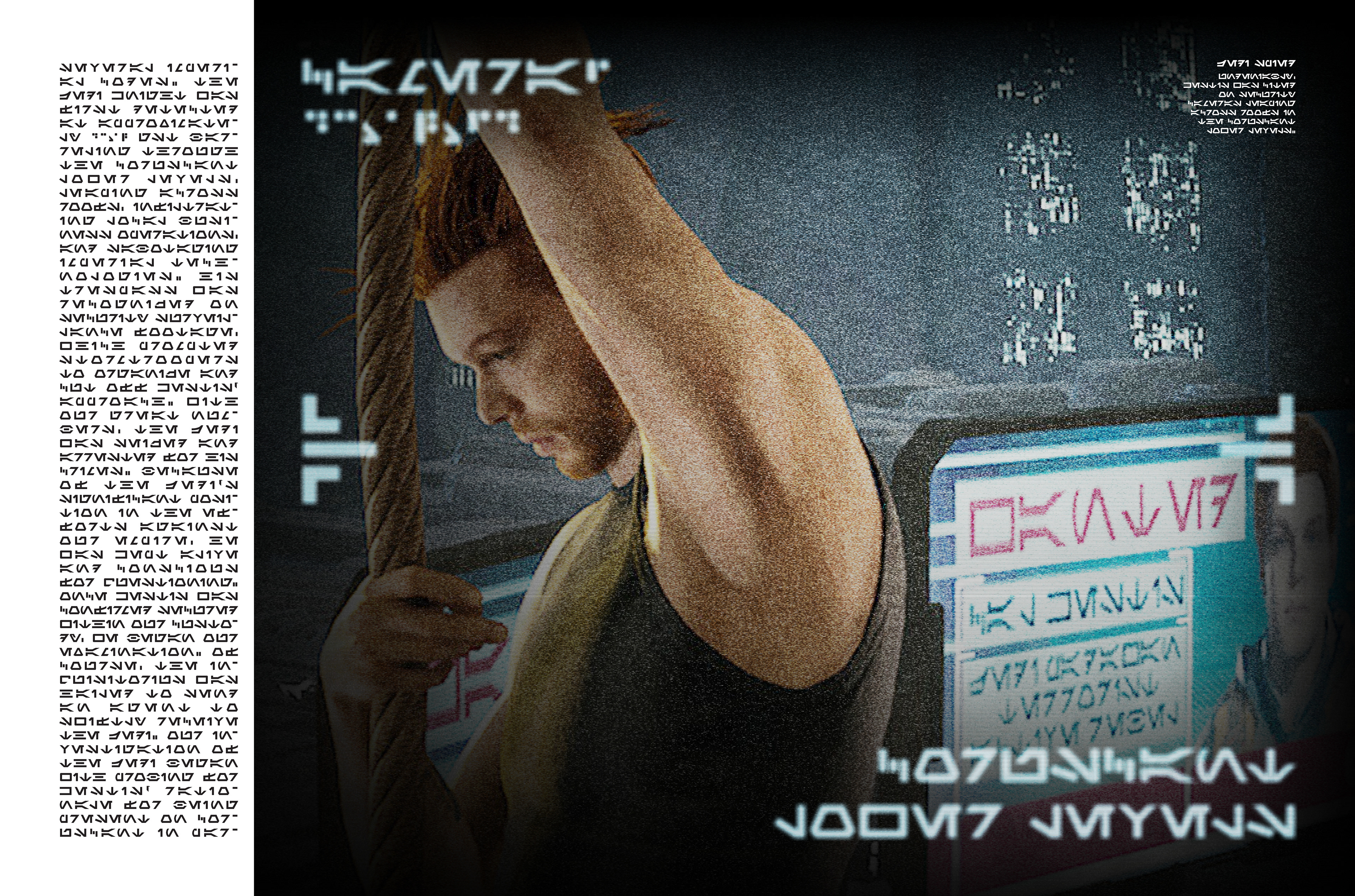
For the most part, I hardly adjusted the in-game captures by FlamMabel. I perhaps increased the contrast and dpi as needed, but there was one image in particular that needed the most work.

This photo needed to look like Cal was being spotted over surveillance footage, not just seen by the naked eye. This would need a camera effect, vignette, and on-screen elements.

The process, includes the final Aurebesh and English versions.
Creating the title treatment for the interior spread was, somehow, the final item I addressed in this process. Beginning with a clean, warped version, this then took on a dissolving/spraypaint stencil effect. This effect was extended to the final English version as well.


Process of title treatment, including Aurebesh and English finals.
Oh no! I sent my file in to the printers and forgot that my page count needs to be divisible by 4! I designed a quick ad spread from the following elements.


Combining these elements and using Aurebesh characters, this was a quick means to create a high-class perfume ad, inspired by Balenciaga ads in Vogue.


Aurebesh Finals


English Finals
The Aurebesh and English files were printed at the Erie St. Digicopy in Milwaukee, WI on 80# Gloss Cover. Two copies were printed of each—one that I would get signed and one that would be given to Monaghan as a gift.
This was a month-long hobby project and it tied together my passion for design, storytelling, and Star Wars. It's really cool to say I designed a one-of-a-kind piece that was accepted by the performer of one of my favorite characters. Monaghan flipped through it briefly at the table, a stand-out moment in the blur of a memory while meeting him. He also chose the marker color he signed with, which pairs perfectly with the accents of the cover—definitely has a good eye. I hope he reads the copies I gifted him with!
Thank you to all the people that I ran this magazine by—Rachel, Nick, FlamMabel, Mom, Dad, Lauren. You made it all the better and I am endlessly thankful for you.
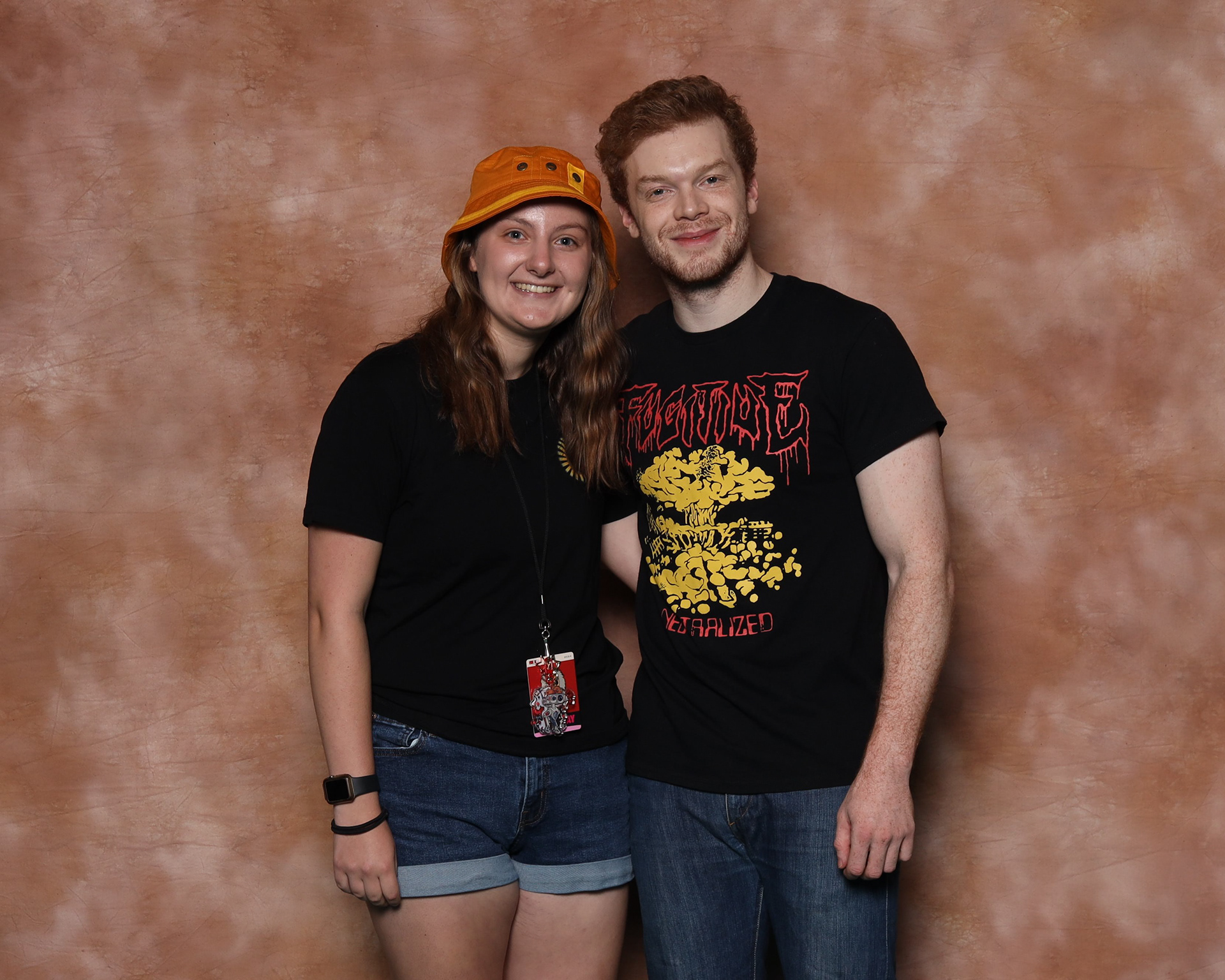
And thank you for your interest in the process of this project! Enjoy this photo of me looking absolutely star-struck next to Cameron Monaghan. I hope his performances and perspective on his craft continue to inspire me to make art.